KREEVO
One visual system, stretched across a bold marketing site and a calm, working product — without either side feeling like a compromise.
The problem
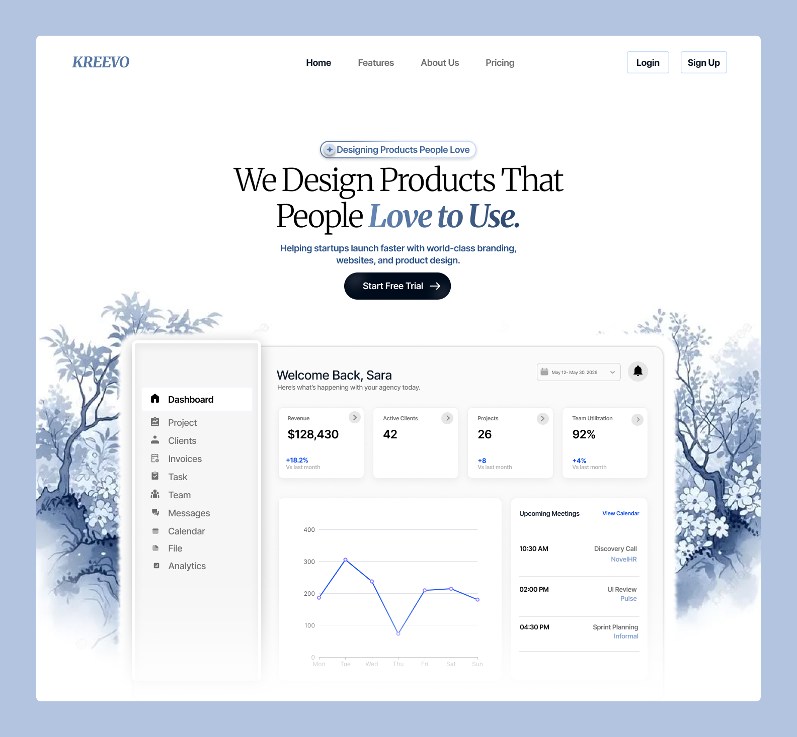
Kreevo's marketing site and its product dashboard were built at different times, by different priorities. The landing page wanted to sell a feeling; the dashboard wanted to stay out of the way and let people work. Side by side, they read as two different products.
The brief wasn't to make the dashboard louder or the marketing site quieter — it was to find a shared visual language expressive enough to sell and disciplined enough to work in, at any density.
One set of tokens, two moods
Instead of two style guides, I built one: type scale, spacing units, corner radii, motion timing and a single accent all shared across surfaces. What changes between marketing and product isn't the system — it's how much of it is turned up.
The landing page uses the full range: oversized type, high contrast, generous motion. The dashboard uses the same tokens at their quietest setting — smaller type steps, tighter spacing, motion that only shows up to confirm an action.
"A design system should be able to whisper on one page and shout on the next — without ever sounding like two different people."
What made it into the product
The dashboard reuses the marketing site's type pairing and grid rhythm, but trades its large display type for a compact, data-first hierarchy — so a returning visitor recognises the brand instantly, without the interface fighting for their attention.