MISOGI
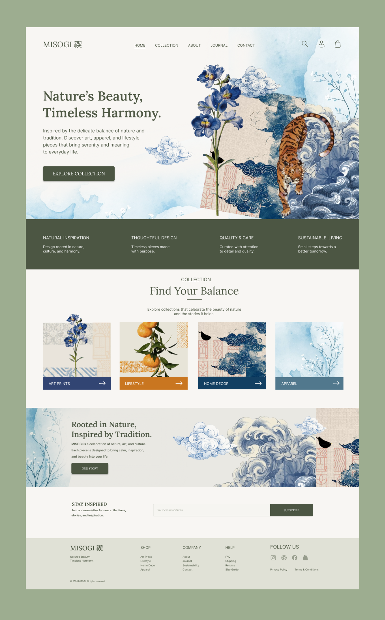
A store for an editorial art brand — designed to read like a magazine first, and sell without ever feeling like a template checkout.
The problem
Most e-commerce templates are optimised for one thing: getting from product grid to checkout as fast as possible. That's the right instinct for volume retail — and the wrong one for a brand whose entire value is atmosphere, restraint and point of view.
Misogi needed commerce mechanics that behaved like commerce, sitting inside pages that read like an art publication rather than a storefront.
Typography as the product photography
Full-bleed imagery and oversized display type carry most of the storytelling — the interface chrome (nav, filters, cart) is intentionally quiet, so it never competes with the work being sold.
Product and price sit close together, but never louder than the piece itself. The goal was for the commercial layer to feel like a caption, not a banner.
"The moment a store looks like every other store, the brand stops being the reason someone buys."
Where commerce had to win
Underneath the editorial surface, the core purchase flow — size, availability, cart, checkout — follows conventional, low-friction e-commerce patterns. Art direction was never allowed to slow down the moment someone actually wants to buy.