NEXUS
Making enterprise analytics feel less like a spreadsheet and more like a decision-making tool.
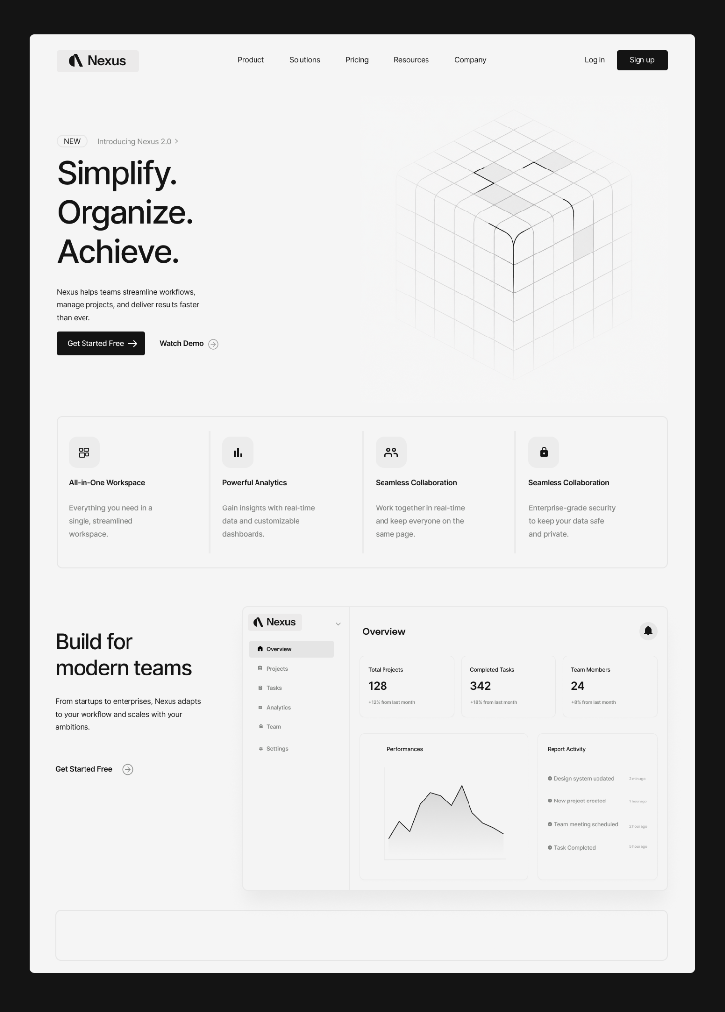
The problem
Enterprise analytics products tend to accumulate information faster than they accumulate hierarchy. The result is a screen full of numbers, filters and competing visual signals.
For NEXUS, the design challenge was to create a workspace where a team could understand what changed, why it mattered and where to act next — without digging through multiple screens.
From data dump to hierarchy
I started by separating the interface into three levels: orientation, signal and detail. The overview answers “what is happening?”, while deeper views answer “why?” and “what do I do next?”
“The interface should help the user notice something — not make the user search for something.”
System before polish
Once the information architecture was stable, I built the UI around a small set of reusable patterns: metric cards, data tables, filters, status states and responsive layout tokens.